The case in 30 seconds
The problem
New salons got lost in their first days: they struggled to find the features they needed, took 8 days to make their first booking and had a hard time following their finances and stock.
My role
Product Designer in a squad with a PM, a tech lead and four developers, working with a UX researcher, a UX writer and marketing.
The outcome
A guided first-access onboarding and a new home that shows the whole business in one place. 92% satisfaction and a SUS score around 80.
user interviews
survey responses
satisfaction (CSAT)
SUS score
A platform for the whole salon
Salão99 is Grupo Boticário's management platform for beauty salons and wellness centers: online booking, fast and secure payments, and employees, finances and products in one place.
Salons still relied on several tools to run the day, talk to clients, learn and buy products. The challenge was to connect Salão99 to the rest of the salon's world, bringing data, education and product sales into one platform.
Lost in the first days
Research pointed to three problems. Users struggled to find the features that met their needs. They made their first booking only 8 days after signing up, because they did not understand what to do. And owners had a hard time following their financial reports and stock levels.
How might wehelp new salons get value in their first days, and keep the whole business in view after that?
Listening before redesigning
After a kickoff, benchmarking and a CSD matrix (certainties, assumptions and doubts), we combined 30 user interviews, 125 survey responses and support feedback with data from the backend, Google Analytics, Hotjar and Clarity on demographics, registration, behavior and revenue.
Features were hard to find
Users struggled to find the features that met their specific needs, so much of the product went unused.
The first booking took 8 days
New users waited 8 days to make their first booking because they did not understand what they needed to do.
Money and stock were hard to follow
Owners struggled to monitor their financial reports and product inventory, the numbers that tell them how the salon is doing.
Two bets from the opportunity tree
A guided first access
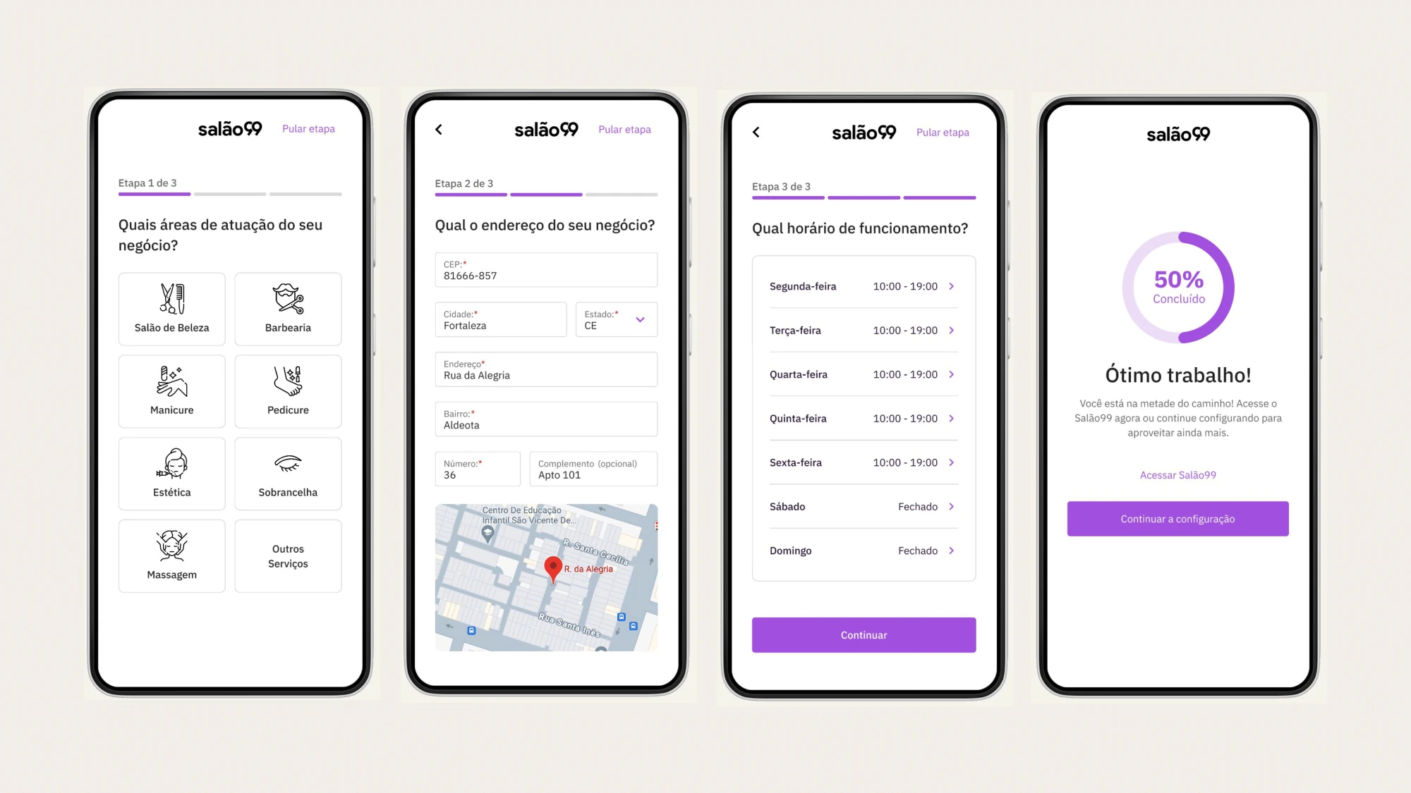
Two of the three problems happened in the first days. A short setup (areas of work, address, opening hours) gets the salon ready before the schedule is empty, and it answered both the lost features and the late first booking.
Every extra step risks losing people before they see the value, so each step can be skipped and progress is always visible.
A home for the whole business
Instead of hunting through a long side menu, the home brings schedule, commissions, sales, finances, stock and courses into one view, with a setup checklist until the salon is ready.
The home has to keep up as the platform grows, with more data and more users, without losing speed or clarity.
A guided start and a new home
Both solutions came from an opportunity solution tree with one goal: improve user satisfaction and the app ratings.
Where we started
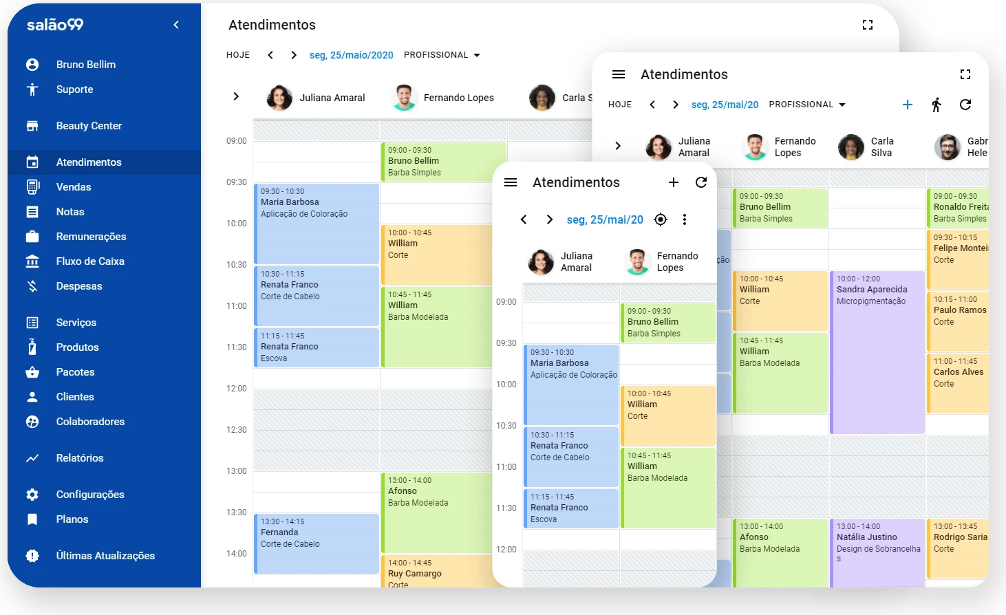
Before the redesign, Salão99 opened straight into the schedule, with every feature listed in a long side menu.
A guided first access
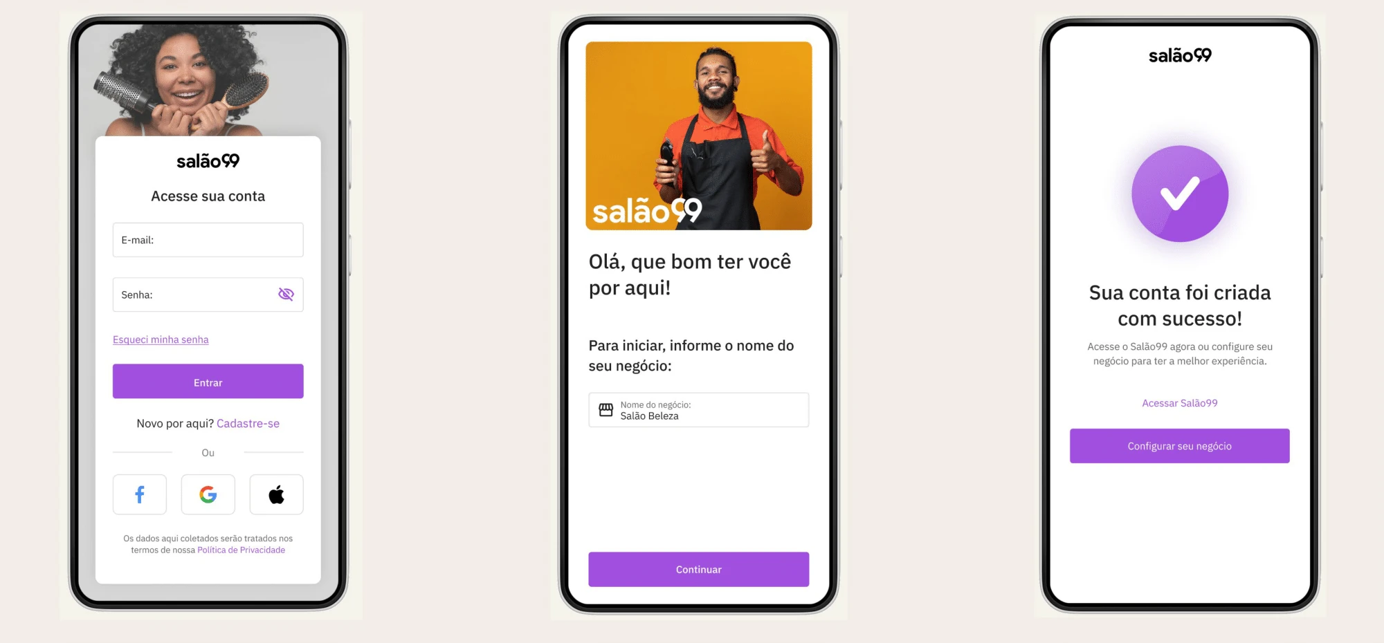
Sign-up asks only for the name of the business. Then three short steps (areas of work, address and opening hours) set up the salon. Each step can be skipped, and a progress ring shows how far along the setup is.
A home for the whole business
The new home brings a setup checklist, shortcuts to schedule, commissions and sales, financial data, a quick view of stock, video lessons and masterclasses for beauty professionals, integration with e-commerce platforms like Beleza na Web PRO, and a section for new features.
Easier to start, better to use
satisfaction (CSAT, 300 users)
customer effort score (CES, 155 users)
SUS score, in the "passed" range (121 users)
heuristic evaluation score
The heuristic evaluation showed the product performs well in most usability areas, with room to improve in error prevention and in help and documentation.
What I'd do differently
- 01Test in smaller, more frequent cycles, to validate hypotheses faster and hear from users earlier.
- 02Design for error prevention: break actions into smaller steps and show progress, so people finish tasks without confusion.
- 03Keep raising consistency across flows and refine the small details. That is where the heuristic score goes from good to excellent.