The case in 30 seconds
The problem
Screen Time is free, but one tap on Ignore Limit undoes it. Hard blockers go the other way, with walls, streaks and guilt that people end up deleting. There was room for something in between.
My role
Everything: product, brand, interface and code. I designed the app and its design system, built it in React Native with Apple's Screen Time APIs, and shipped the marketing site.
The outcome
Calma, live on the App Store in English, Portuguese and Spanish, and trycalma.app, a guide-led site built to be found on search.
Screen Time, but kinder
Calma is a gentle app blocker for iPhone. You pick the apps that pull you away (Instagram, TikTok, YouTube), choose the parts of your day you want back, like work, dinner or bedtime, and Calma rests those apps during those times using Apple's Screen Time.
It is a side project I run end to end: product decisions, design, the iOS app and the site that brings people to it.
Limits are one tap from Ignore
Most scrolling starts as a reflex: you unlock the phone to check the time and land in a feed. Screen Time only counts minutes, and by the time its limit shows up, one tap on Ignore Limit wins. Hard blockers answer with walls, and a lockout that feels like punishment tends to get deleted.
How might wecatch the reflex at the right moment, without turning the phone into a punishment?
Where Calma sits
Before designing, I mapped the tools people already try and where each one fails them.
Built in, easy to ignore
Screen Time is free and everyone starts there, but Ignore Limit is always one tap away.
Walls invite escape
Blockers that lock you out work until they feel like punishment. Then they get deleted or quietly worked around.
The pause is the gap
A short pause at the moment of opening catches the reflex. A calm blocker built on Screen Time was the space nobody owned.
Principles I designed by
A pause, not a wall
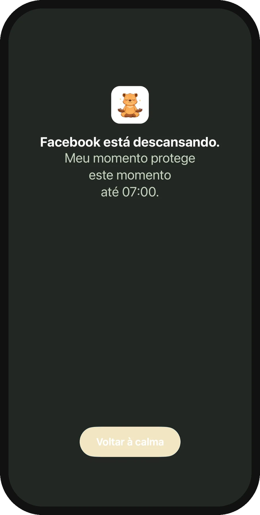
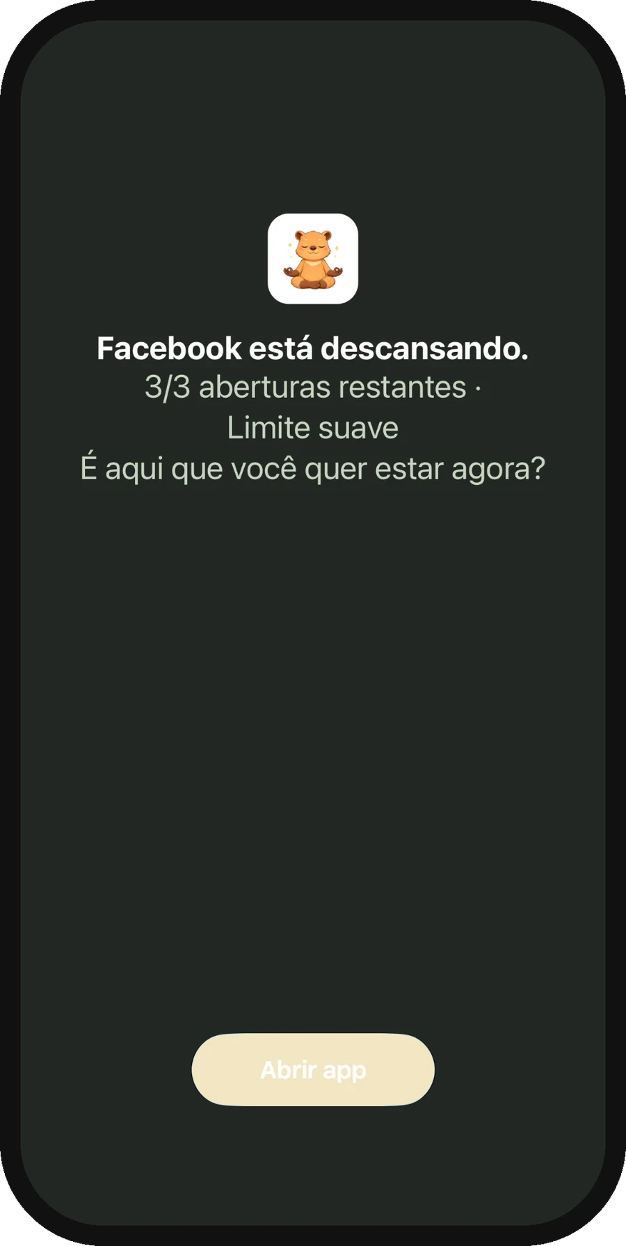
Blocks are applied by iOS, so they hold even when Calma is closed. But the block screen is calm: the app "is resting", with one way back to calm.
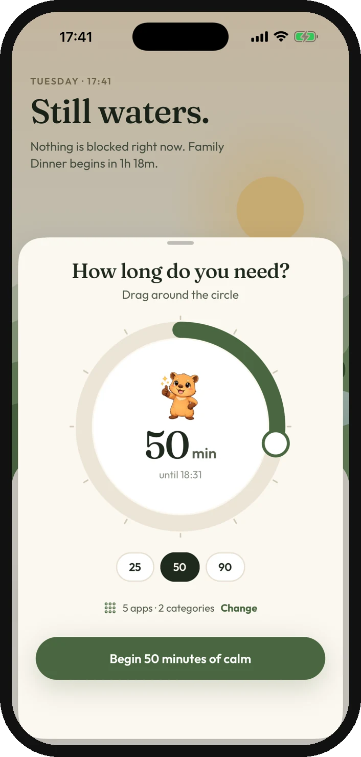
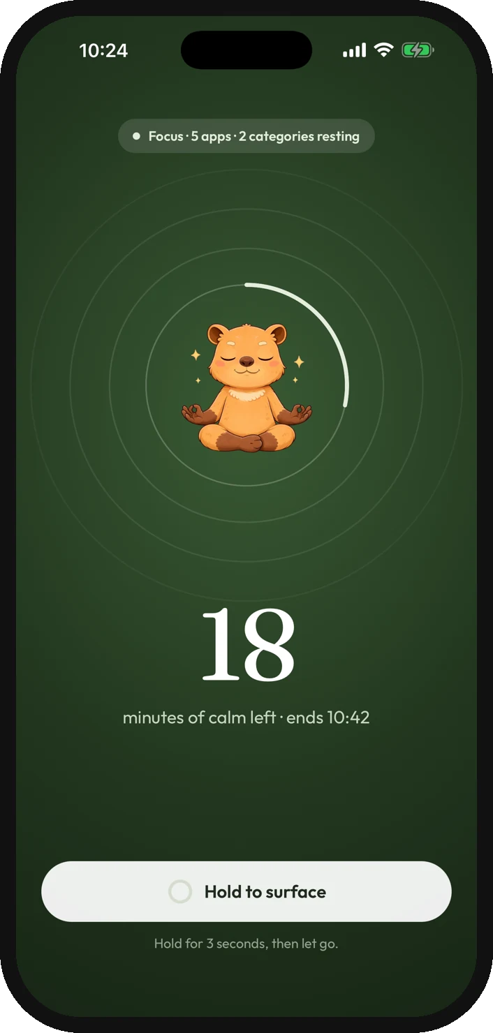
A gentle blocker is easier to skip, so leaving has a cost: a focus session only ends early with a 3-second hold.
No streaks, no scores, no shame
The only progress number is time protected. No leaderboards, usage charts or guilt messages, because shame makes people quit the tool, not the habit.
Less of the gamified feedback that drives engagement in other apps.
Moments, not rules
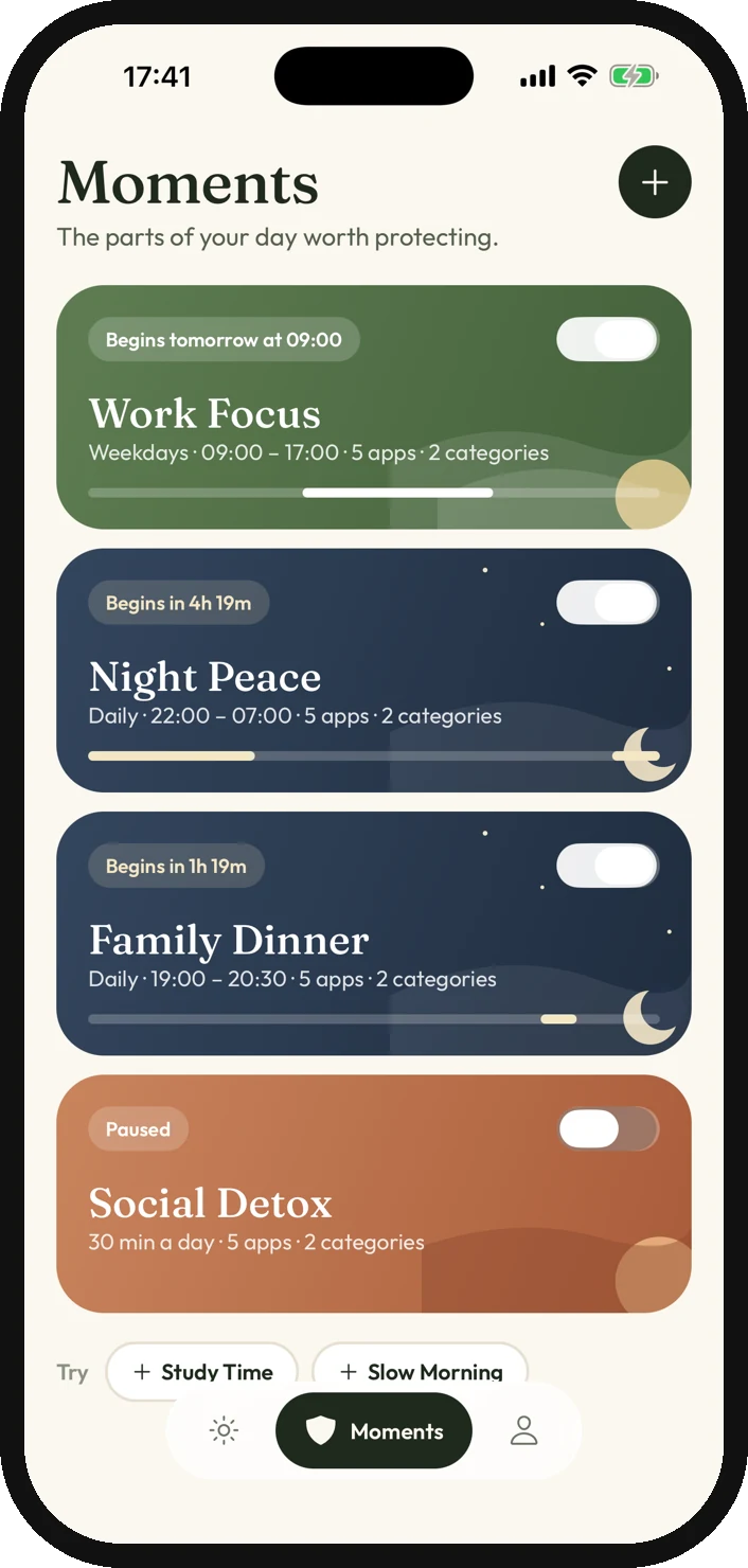
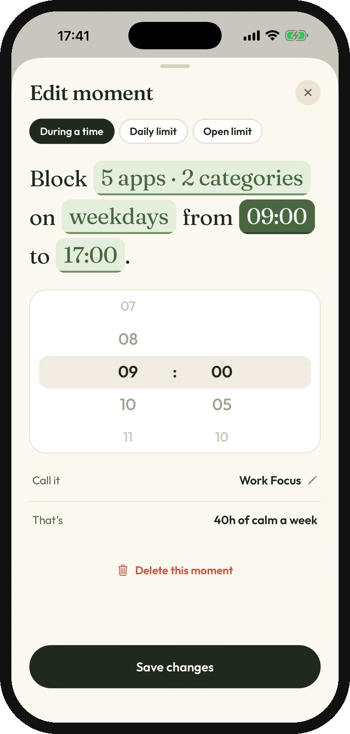
People think in parts of the day, not in schedules and categories. Every rule reads as a sentence, "Block 5 apps on weekdays from 09:00 to 17:00", and lives in a Moment like Work Focus or Night Peace.
Time windows, daily limits and open limits all had to fit the same sentence pattern.
Private by default
No account and no cloud: rules stay on the iPhone, and Calma cannot see what you do inside apps.
No sync between devices and no backup of your Moments.
A quiet place on the phone
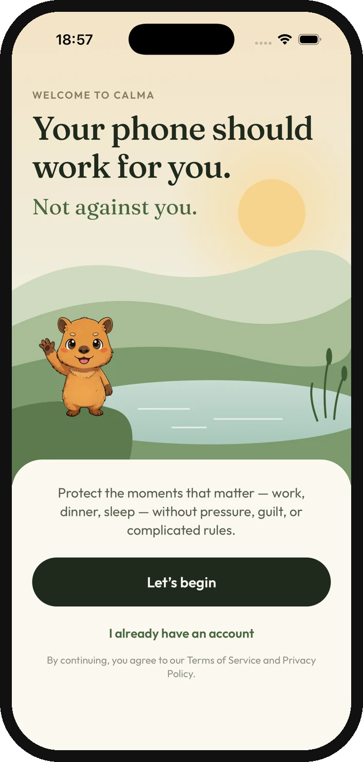
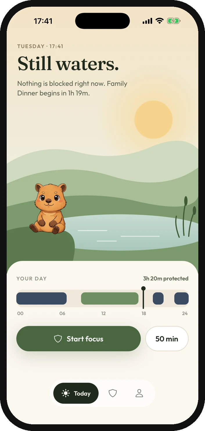
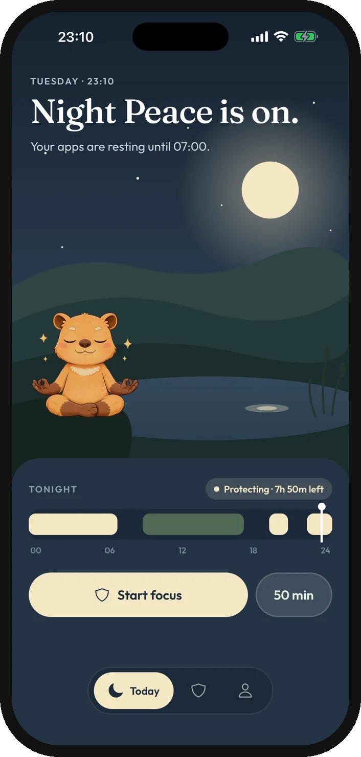
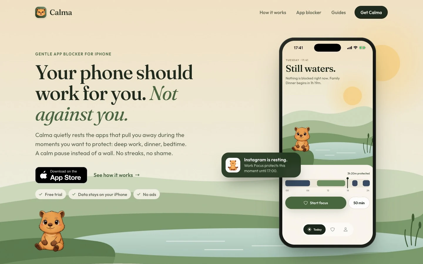
The app is built around the day it protects: the scene moves from morning to night, and a capybara mirrors how things are going without ever judging.
Today, from morning to night
The home shows what is resting and what comes next, on a landscape that follows the time of day. A timeline marks the moments protected today.
Moments, written as sentences
Each Moment is a rule you can read out loud. Pick the apps, the days and the times, or start from a ready-made routine like Work Focus, Night Peace or Family Dinner.
Focus, and the resting screen
Focus sessions run from 15 to 180 minutes and end on their own. When a resting app is opened, iOS shows the block screen designed for Calma instead.
A capybara that never judges
The mascot reflects the state of your day and breathes slowly on screen. It gives the product warmth without turning it into a game.





trycalma.app, a site built to be found
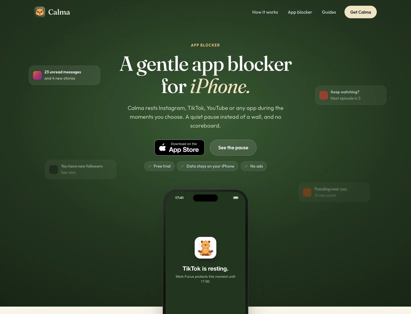
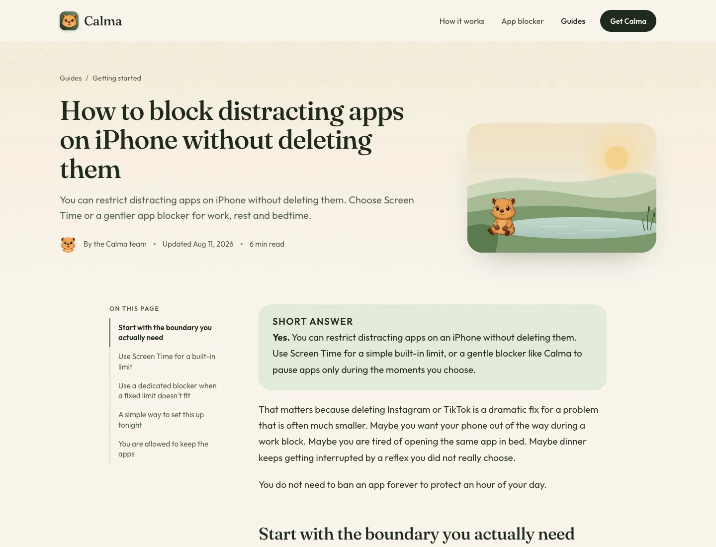
I designed the site as a day from morning to night, like the app, and built it with Astro. Its job is to get Calma found: guides that answer what people search, honest comparisons with other blockers, and a brief of allowed claims that keeps every page true.
Live, and still early
Calma is on the App Store in English, Portuguese and Spanish, with a Pro subscription and a free trial, and trycalma.app is growing through its guides. It is early, so I'm not quoting numbers yet.
What I learned
- 01Owning the whole product changes how you design. Every screen had to be worth building, testing and supporting myself.
- 02Platform constraints are design material. Screen Time decides what a blocker can do; the craft was making those limits feel calm instead of broken.
- 03Tone is a feature. Removing streaks and guilt was a product decision, not a copy tweak.